
Fruugo · Company-wide UX
Localisation at Fruugo
Approx. 7 min read
From shopper trust concerns to a contextual multilingual audit, clearer typography and language controls across Fruugo.
- My role
- UX research, multilingual auditing, prioritisation and cross-team design direction
- Status
- Merchant language switching implemented in test; wider deployment planned


Portrait localisation illustration · Multilingual typography illustrated in portrait format; this is not an interface screenshot.
The problem and goal
Face-to-face interviews with Polish-speaking shoppers exposed a trust problem: inconsistent characters made the marketplace look unreliable. Some participants associated the typography with possible fraud and felt uncertain about purchasing again. A small visual defect had become a barrier to confidence.
Hotjar recordings revealed a related problem in merchant tools. Merchants used browser translation to understand English instructions, but translations sometimes changed the meaning of operational terminology. The goal was to make shopping and merchant tasks clearer in the languages people use, through typography, contextual translations and personal language choice.
My role and collaboration
Translation work had repeatedly been considered too large to tackle. I challenged that constraint by building a local capture workflow covering just under 800 Marketplace views per supported language, then using AI analysis to identify and prioritise issues in context.
I took the findings directly to the CTO, Product and the Marketplace technical lead. I collaborated with the other lead UX designer on the typography direction, language controls and required interface updates for marketplace users and merchants.
Research and findings
Reviewing translations in a CSV removed the context needed to judge their meaning. I used Puppeteer to capture the configured Marketplace across discovery, product pages, accounts, help, policies and checkout in each supported language.
AI analysis identified candidate problems and suggested corrections. I prioritised misleading labels and trust barriers, then asked colleagues who speak the relevant languages to review them in context. Coverage varied between languages.
Merchant registration data helped prioritise Simplified Chinese, while GA4 showed the wider shopper-language need. With 85.3% of registrations coming from China, Simplified Chinese was a clear priority. This country figure indicates audience need rather than confirming each merchant’s language preference, so the interface leaves that choice to the individual.
85.3%
Registrations from China
Registered country is a proxy for language need, not confirmed native language.
57.9%
Non-English shopper language
Share of non-English shopper language in the GA4 analysis.
~800
Screenshots per language
Just under 800 contextual interface captures per supported language.
Capture in context
Use the configured Marketplace and Puppeteer to capture the interface across language variants.
Surface candidate issues
Use AI to identify patterns and propose corrections alongside the surrounding interface.
Prioritise by user impact
Escalate misleading task labels and trust barriers before smaller, workable inconsistencies.
Validate flagged changes
Ask internal speakers of the relevant languages to check the proposed changes in context.
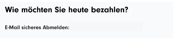
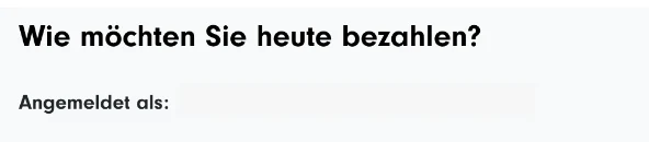
German checkout: a small label with a large consequence
Beside the shopper’s completed email details, ‘E-Mail sicheres Abmelden’ used wording associated with logging out. At checkout, that could make the user uncertain about their account state or whether their details had been retained. The updated screen uses ‘Angemeldet als’, meaning ‘Signed in as’.
The revised wording makes the account state clearer at checkout. Its effect on shopper confidence and completion will be reviewed after release.
Before · German checkout
After · implemented, awaiting deployment
Design approach and decisions
The audit connected individual defects to shared design decisions. I focused on readable typography, language choice independent of store country, and clear separation between a merchant’s personal interface preference and their company’s reply language.
Typography: consistent characters across languages
Neuzeit Grotesk lacked some characters needed by supported languages, so labels fell back to a different font. We selected Noto Sans for broader script coverage and more consistent typography. It also removed the Adobe Typekit dependency and let us use the same typeface in Google Workspace documents.
The same Polish category labels are enlarged below. Look at the accented ‘ó’ in ‘ogród’ and ‘Wystrój’, and how it sits with the surrounding letters. Polish-speaking participants noticed the inconsistency even when it was easy for other readers to miss. Text also wraps differently after the font change, reinforcing the need to check layouts using real translations.
Noto Sans requires appropriate fonts for the scripts being displayed. I recommended font-display: swap to keep text visible during loading, and the frontend team implemented the loading changes.
Before · Neuzeit Grotesk

After · Noto Sans, awaiting deployment

Shopper controls: separate language from country
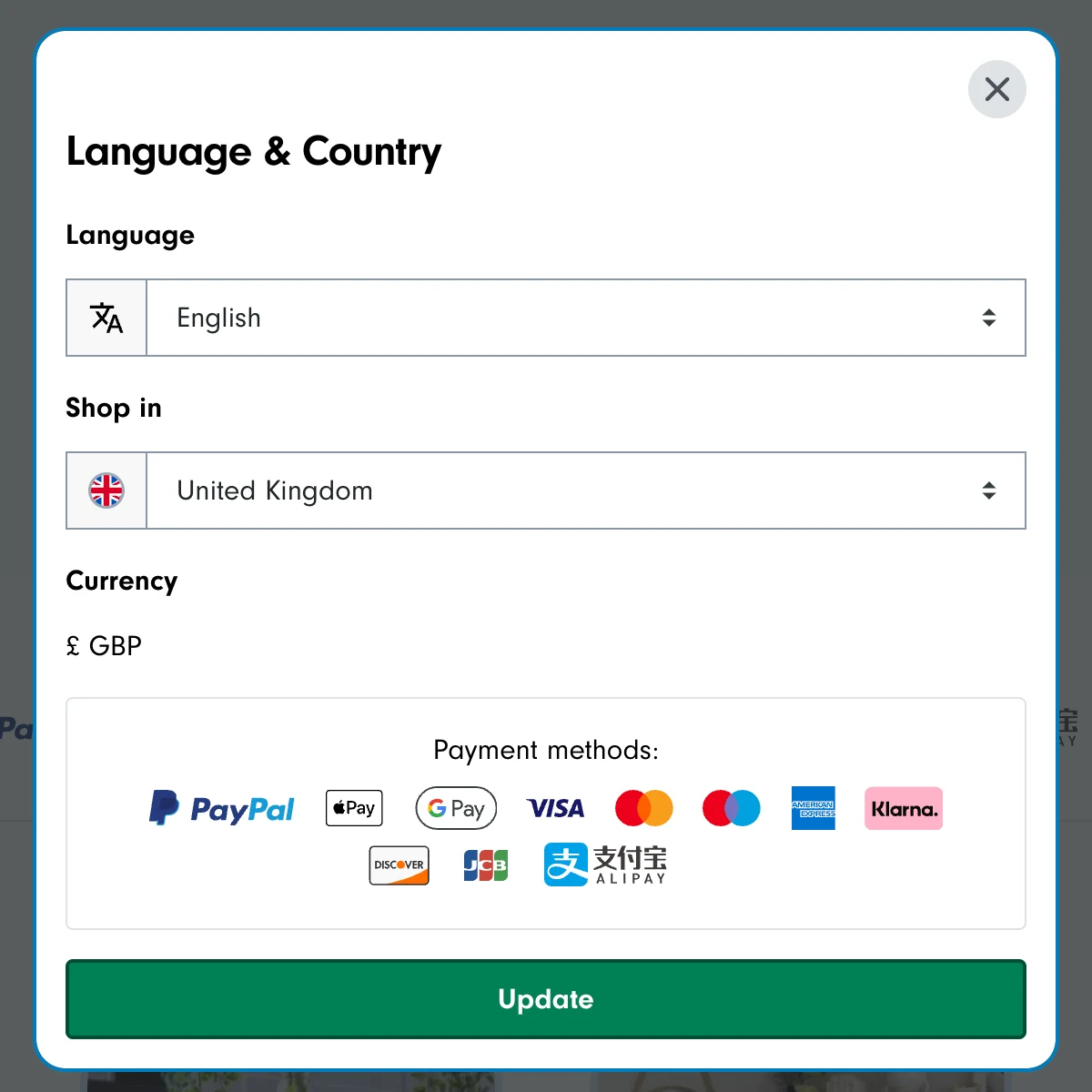
I collaborated on a picker that lets shoppers select their language independently from the country store. Currency and payment methods remain visible before they select Update, helping people understand the store context.
The flag trigger sits in the header, with a consistent position across desktop and mobile. A compact footer trigger replaces the previous country and language lists. Language names and selected-country text support recognition, rather than relying on a flag to represent language.
The design includes warnings where changing stores could discard shopping progress. Keyboard operation, focus return and longer translated labels are part of the interaction requirements, with release testing still to complete.
Header trigger · implemented, awaiting deployment

Language and country picker · implemented, awaiting deployment
Before · footer country and language lists

After · compact footer trigger, awaiting deployment

Merchant tools: personal interface language
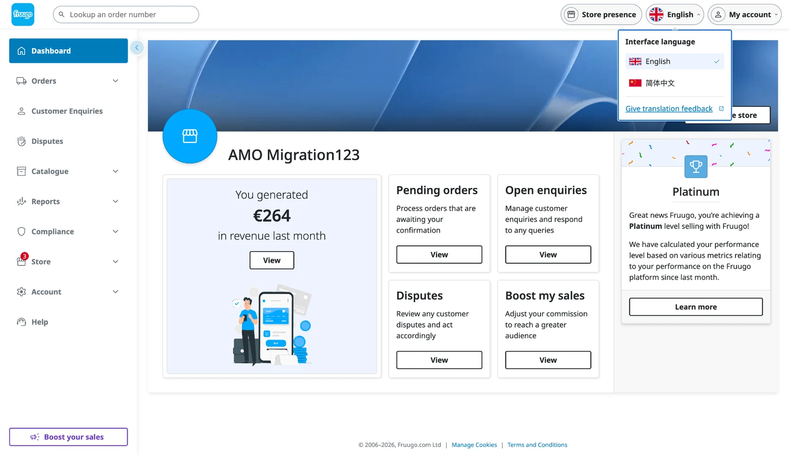
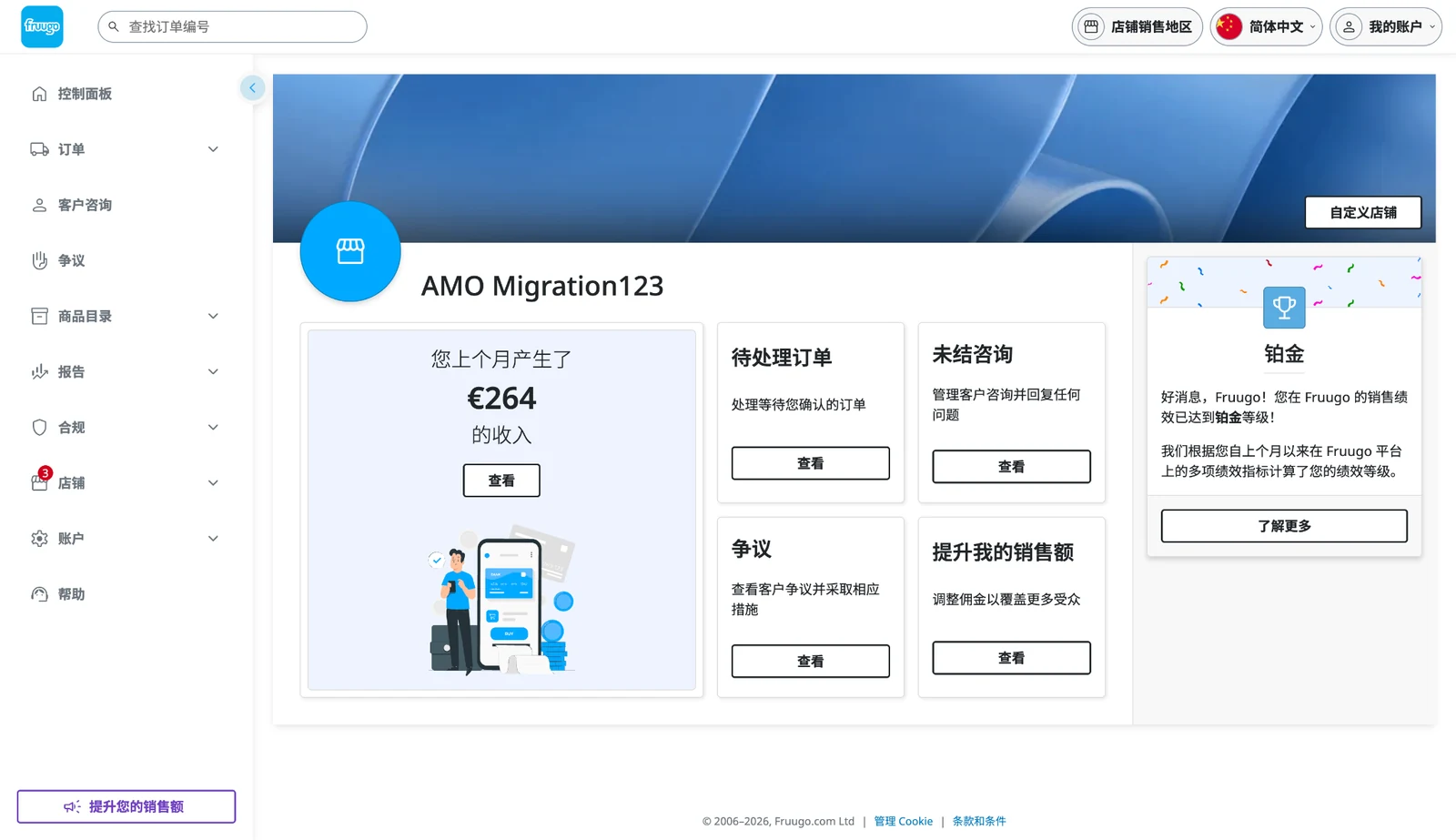
I designed a personal language picker in the merchant header, now implemented in the test environment for English and Simplified Chinese. Merchants can choose the language they prefer for their own work without changing their company’s customer-reply language. Their interface preference persists across views.
The change reaches beyond the picker: navigation, dashboard headings, task instructions and actions adapt to Simplified Chinese. The examples below show the same order, enquiry and dispute tasks in both languages. This gives merchants a supported alternative to browser translation, helping them work in familiar language while retaining consistent product terminology.
The aim is to reduce language barriers to selling, supporting Fruugo’s ambition to let anyone, anywhere sell. Easier comprehension and more efficient task completion are the intended benefits; their impact will be assessed after release.
Changing interface language refreshes the current page. The interaction design includes a warning about unsaved edits and offers a way to keep editing before the refresh discards input. A translation-feedback route helps merchants report terminology that does not make sense in context.
Personal language choice · test environment
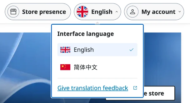
English · dashboard task cards
Simplified Chinese · after language change
Validation and iteration
Colleagues who speak the relevant languages reviewed the flagged findings in the interface. Their feedback helped check terminology and prioritise changes with Product and Engineering.
The merchant screenshots demonstrate the language change across the dashboard in the test environment. They show the implementation, rather than a measured improvement in merchant task completion. Release validation still includes keyboard and screen-reader behaviour, mobile reflow, real translated strings and font loading.
Delivery and outcomes
The work turned a translation problem that had been difficult to scope into agreed priorities across Marketplace, Checkout and merchant tools. We established a repeatable audit process, selected shared typography and designed clearer language controls.
Merchant language switching is implemented in the test environment, with English and Simplified Chinese available as personal preferences. The wider programme is awaiting production deployment. After release, I will review language choice, shopper confidence and merchant task completion.
Research made actionable
Contextual capture and targeted human review created a practical route from findings to delivery priorities.
Typography direction agreed
Noto Sans selected across shopper and merchant interfaces, with script coverage and loading considerations.
Merchant language switching implemented
English and Simplified Chinese adapt the merchant interface in the test environment. Independent shopper language and store selection are also designed.
Learning and next steps
Localisation needs interface context. A character shape or short label can look minor but affect confidence at an important step. Automation made the review manageable, while native-language feedback helped us interpret the findings.
After deployment, I will review language-selection usage, key journey completion and translation feedback across markets. Ongoing checks will cover longer labels, right-to-left layouts, keyboard operation and font loading as templates and translations change.