
Fruugo · Merchant experience
Merchant onboarding
Approx. 5 min read
Shortening the application, moving integration questions to the right stage and connecting the information teams need to review new merchants.
- My role
- UX design, behavioural research, cross-team collaboration and implementation refinement
- Status
- Live, with ongoing post-launch review
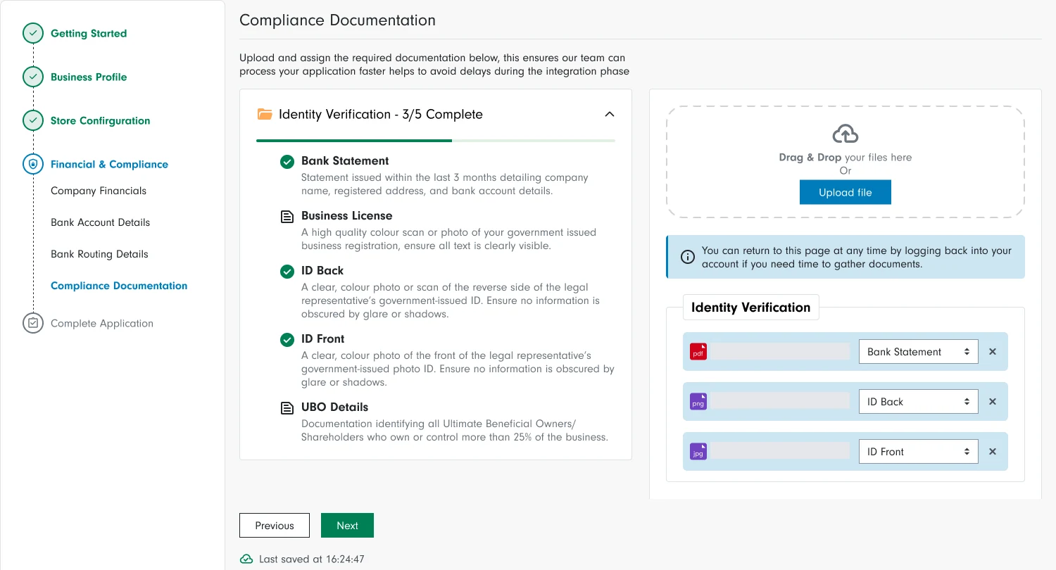
Mobile application entry · The mobile entry point offers clear routes to start or resume an application.
The problem and goal
Merchants faced a lengthy application that asked for information before it was needed. Many questions belonged to the later integration stage, adding effort to the initial application without helping most merchants progress.
Simplifying the form also meant understanding the needs of the teams reviewing and supporting applicants. The challenge was to ask for less upfront while retaining the information needed for review, verification and integration.
My role and collaboration
I worked with Product, Sales, Account Management, Technical Integration and Engineering to simplify the application. I used completion-time evidence to help agree which information was needed to assess a merchant and which could wait until integration.
I led the form design changes and used Hotjar recordings and GA4 journey data to refine the implementation. The work also involved coordinating with process automation engineers so teams could access information already provided.
Research and findings
Hotjar recordings and GA4 drop-off points helped us investigate how merchants completed the application. Recordings showed reliance on browser translation plugins and uncertainty around required financial and tax information. The plugins did not always translate the experience reliably.
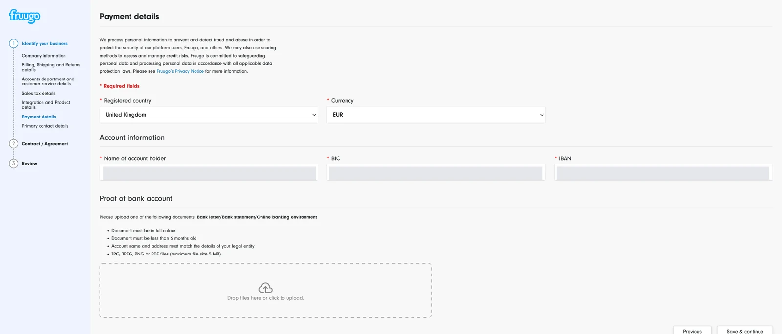
A specific problem was the gap between familiar formatting and technical validation. Merchants added spaces or dashes to identifiers such as IBAN, BIC and sales tax/VAT numbers, but the application rejected inputs that did not match its formatting rules. To the merchant, the information could look correct without being accepted by the system.
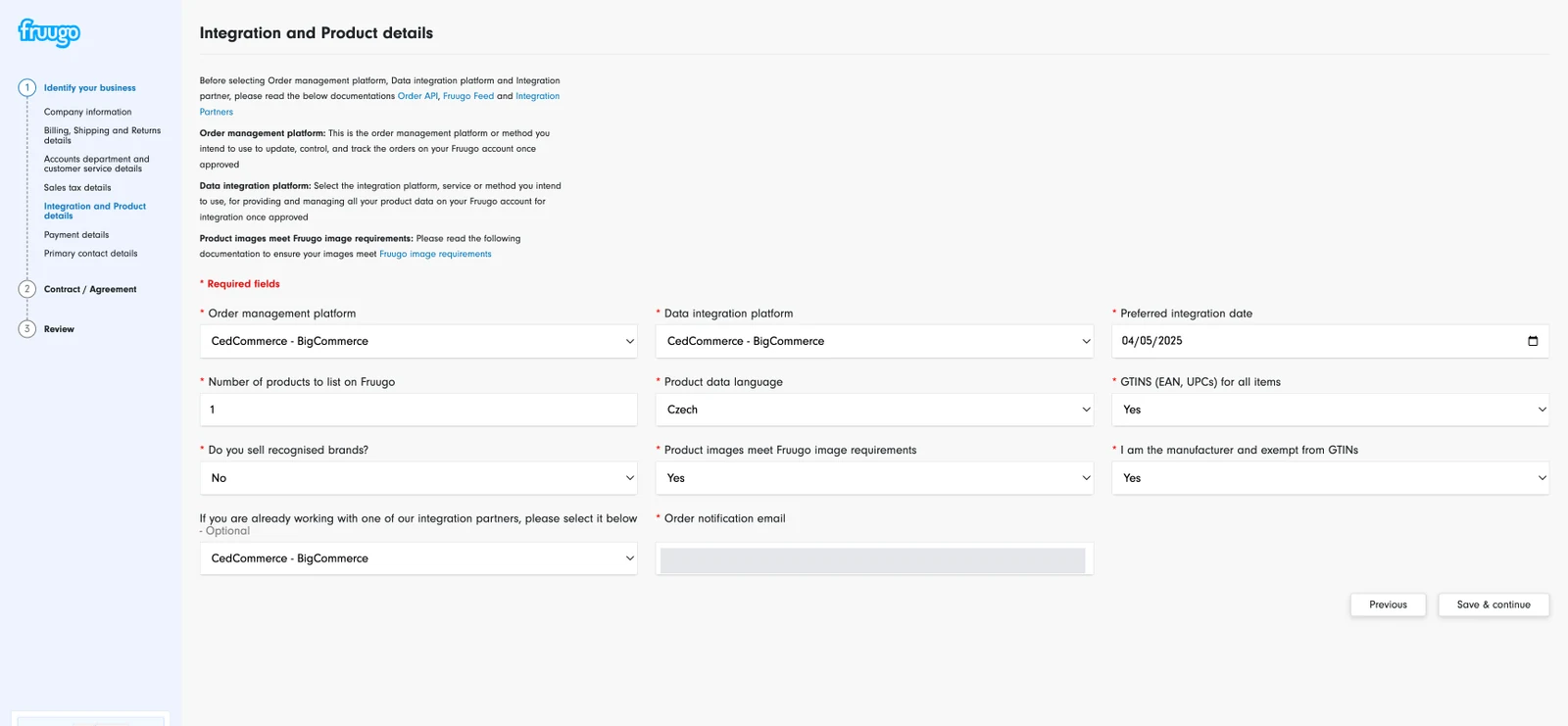
The original application spread questions across three input columns and mixed integration requirements with product declarations. These findings informed clearer grouping, fewer low-value questions and more explicit formatting guidance.
Design approach and decisions
The redesign separated reducing the amount we asked from improving how we asked it. Some requirements moved to integration, some questions were removed, and others became more specific so the information would be useful to the teams receiving it.
Agree what belongs in the application
The hardest decision was agreeing which questions to remove or move. Sales wanted enough information to assess prospective merchants, while Technical Integration wanted the details needed to connect their systems. Both teams had valid needs, but collecting everything upfront made the application longer before a merchant had been assessed.
I brought completion-time evidence into those discussions to show the effort we were asking of merchants. This helped us agree that the application should capture enough information to assess their suitability, with further technical details collected during direct contact with the integration team. Those conversations would still be needed even if the merchant had answered the questions earlier.
Moving questions also meant making sure teams could access information already provided. I worked with the engineering team responsible for process automation on a shared data flow between the CRM and internal tools. The approach kept merchant information in sync across systems, with teams requesting additional details when they were needed.
Replace declarations with useful information
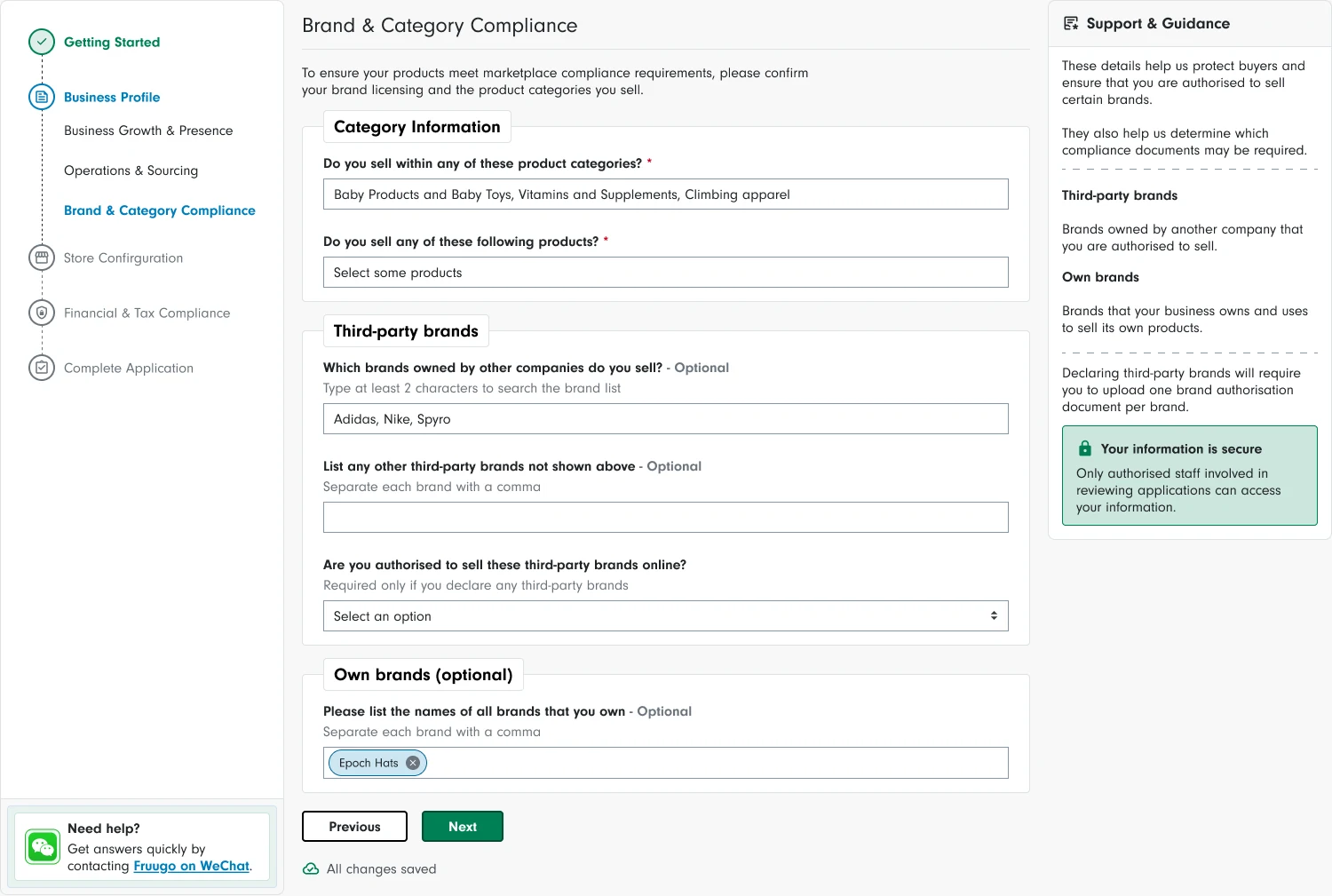
“Do you sell recognised brands?” offered a yes/no declaration that was difficult to verify and gave integration teams little detail. This was replaced with specific brand information to support prioritisation. The Figma design separates third-party brands, own brands and contextual guidance, rather than relying on a broad assertion.
“Product images meet Fruugo image requirements” was removed entirely. A self-declared answer did not establish image quality, so retaining the question added work without dependable evidence.
The original three-column page mixed several topics. The design groups related information and uses fewer input columns, with guidance alongside the relevant questions. This makes the intended reading order clearer without treating a lower question count as the only measure of improvement.
Before · original application
After · Figma design
Make financial details easier to enter
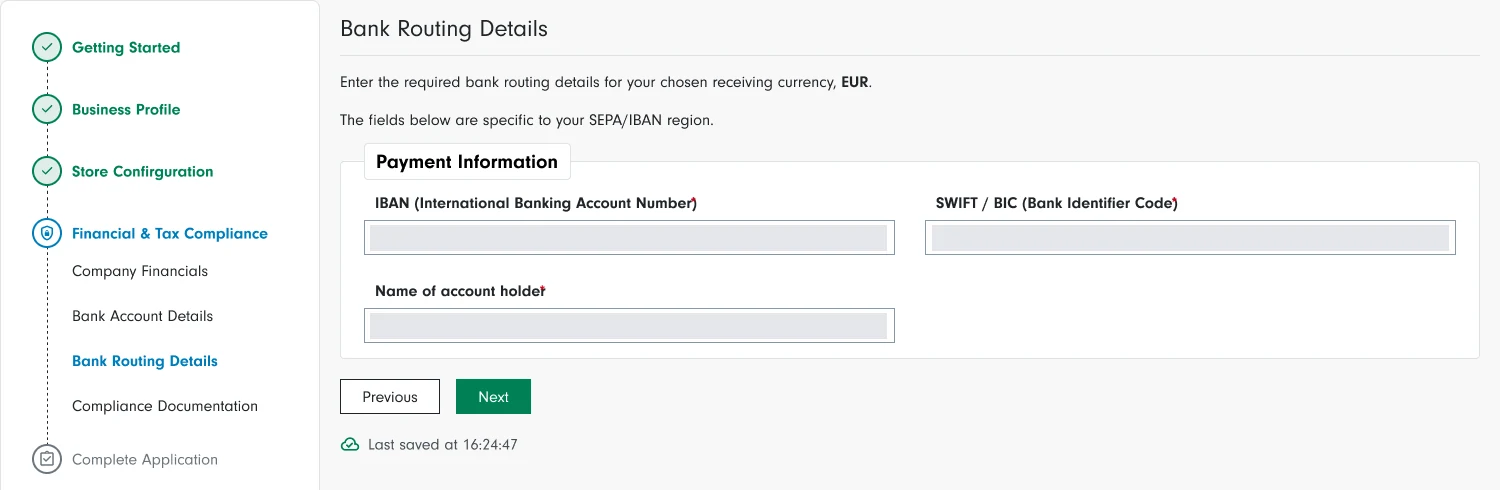
Merchants entered banking and tax identifiers using familiar spaces and dashes, but the form rejected them without explaining why.
I introduced input masking, clearer inline guidance and expanded IBAN and SWIFT/BIC labels. These changes explain the required format at the point of entry and help merchants correct errors.
Before · original application
After · Figma design
Make document requirements clear and manageable
I brought the document checklist, upload controls and progress together, with clear descriptions of what merchants needed to provide.
The interface explains that they can return later to gather missing documents. This makes the requirements easier to manage without forcing completion in one sitting.
Design detail · Figma
Validation and iteration
After launch, we reviewed recordings and journey data alongside the feedback collected at the end of the application. This helped us investigate both completion behaviour and how merchants felt about the effort involved.
Delivery and outcomes
Working with the process automation engineers and the teams responsible for review, verification and integration, we connected application data with Salesforce, Monday.com and in-house tools. Keeping the information in sync gave teams a shared source of merchant data and reduced manual handling as applications progressed.
The early post-launch Hotjar survey received 24 responses. Merchants gave positive average ratings for the effort required and how long completion felt.
The fastest start-to-finish submission recorded in Hotjar was 8 minutes 7 seconds. The previous application had been reported as taking approximately 20 minutes; the newer figure represents the quickest observed completion, rather than an average.
4.5 / 5
Perceived completion effort
Average effort rating from the early post-launch Hotjar survey, with 24 total responses.
4.3 / 5
Perceived time to complete
Average rating for how long completion felt, from the same survey.
8m 7s
Fastest observed submission
Quickest start-to-finish application in the early Hotjar review, rather than the average completion time.
Learning and next steps
This project reinforced that simplifying onboarding depends on agreeing when information is needed, as well as improving the form itself. Showing the effort involved helped me build agreement across teams, while the shared data flow supported their work after the application.
The next step is to build on the early feedback by examining completion rates, typical completion times and where merchants still leave the journey. Reviewing these alongside verification quality and application-review effort would help identify further improvements for merchants and internal teams.