Personal · Native Android design
NextRamble for Android
Approx. 7 min read
Adapting my live group-walking service into a native Android experience, using Material 3, platform interactions and a working build on my own phone.
At a glance
- Problem
- The web service already supports group planning. I explored how a native companion could make finding the next walk and preparing to leave feel familiar on Android.
- My approach
- Adapted the journeys in Figma using Material 3, connected the theme to a Kotlin and Jetpack Compose build, and reviewed the running app on my Samsung Galaxy S23 FE.
- Outcome
- A working native test build connected to the existing service, with light and dark themes, haptic feedback confirmation and hand-offs to Android apps.
- My role
- Independent UX/UI design, Figma theming and AI-assisted native prototyping
- Status
- Working Android test build · Not publicly released
- Project period
- Personal exploration · November 2026 · Ongoing
Working Android build · Light and dark themes
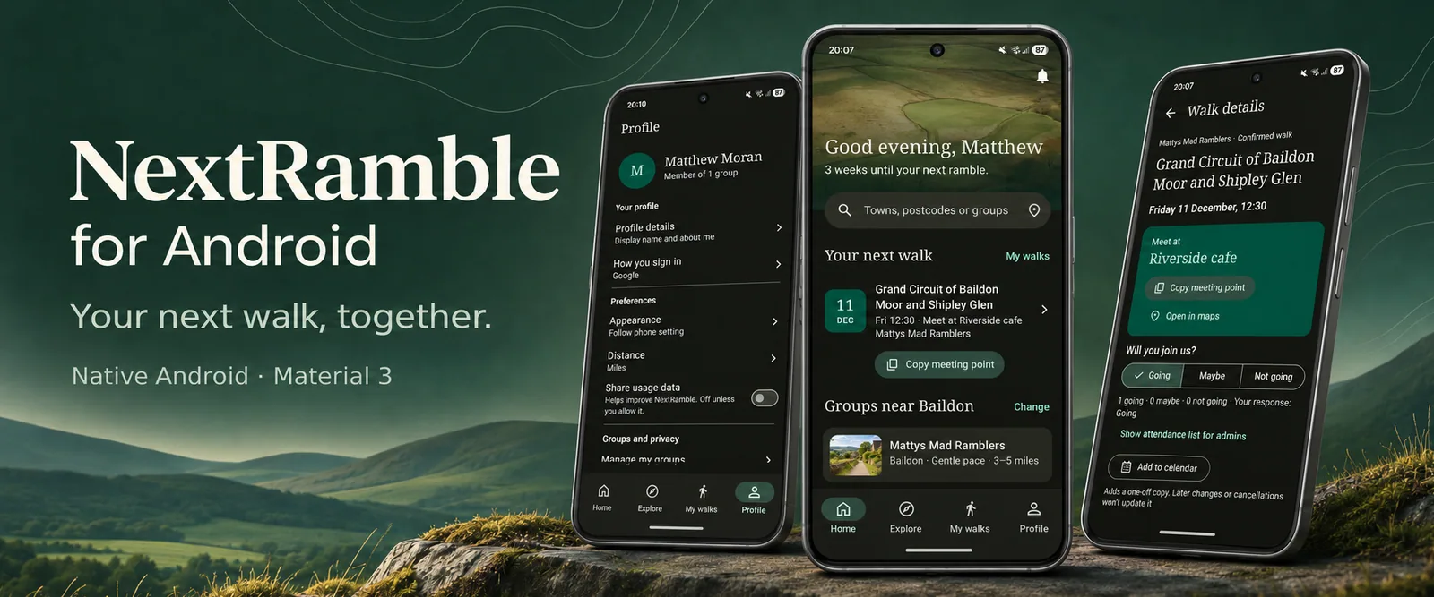
The problem: adapt the task, not just the screen size
I had already designed and launched NextRamble as a web service for discovering walking groups, comparing proposals and confirming an outing. The Android exploration asked a different question: how should that service behave as a native companion when someone wants to check their next walk, respond and get ready to leave?
I kept the same group-planning model, while adapting navigation, controls and feedback to the platform. A responsive web page could already fit a phone; the purpose here was to explore what native interaction could add.
My role and the working scope
I owned the interaction design, visual direction and Figma theming, then used AI-assisted implementation to develop and iterate on a Kotlin and Jetpack Compose app in Android Studio. Running a local build on my Samsung Galaxy S23 FE let me move beyond a linked-screen prototype and inspect real scrolling, system controls and device feedback.
The build connects to the web service’s Firebase authentication and shared planning data. It includes discovery, walk details, attendance, group membership, planning and profile preferences. Signed-out sample content supports exploration. Some tasks, including group settings and walking-area guides, deliberately open the web service rather than duplicating everything natively. Push notifications and public app-store distribution remain outside the initial delivered scope.
Keep familiar patterns, bring the NextRamble identity
I started with Google’s Material 3 Design Kit in Figma and used Material Theme Builder to apply the already defined NextRamble identity. Colour roles, typography and component states provided a shared structure for the design file and Compose theme, including separate light and dark schemes.
I retained familiar patterns such as bottom navigation, filter chips, sheets and date and time pickers, rather than drawing a bespoke version of every control. Jakob’s Law informed that choice: established patterns can help people transfer expectations. Material 3 gave me a familiar starting point while leaving room for NextRamble’s identity. I still need to validate whether those patterns help people complete this particular journey.
Further reading: Android DevelopersLaws of UX
One theme structure, two appearances
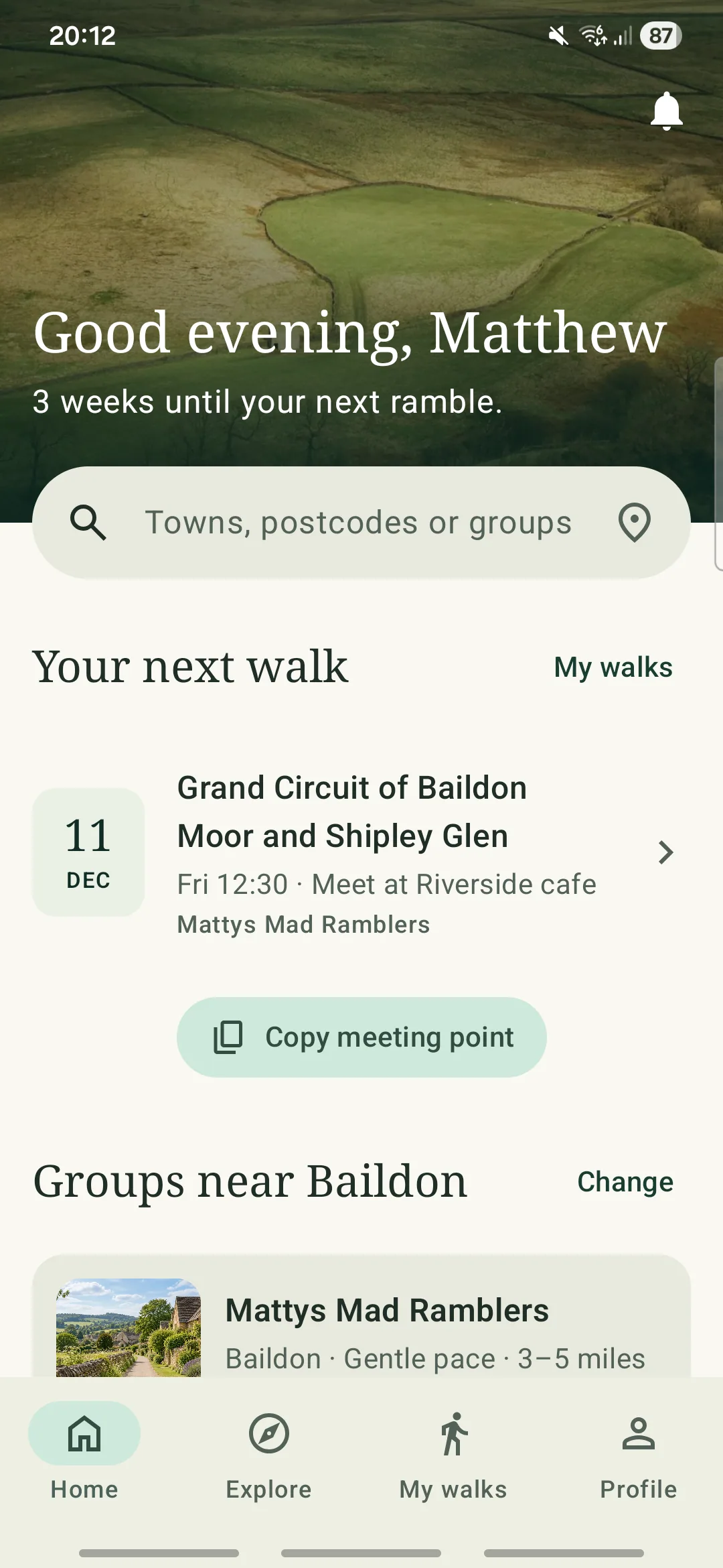
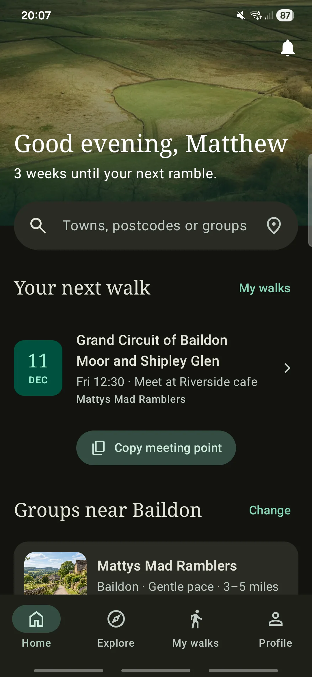
The app uses semantic colour roles in shared components, with an appearance preference for system, light or dark. The green brand identity carries across both themes without treating dark mode as a simple colour inversion.
Android Home · Light theme
Android Home · Dark theme
Make discovery recoverable
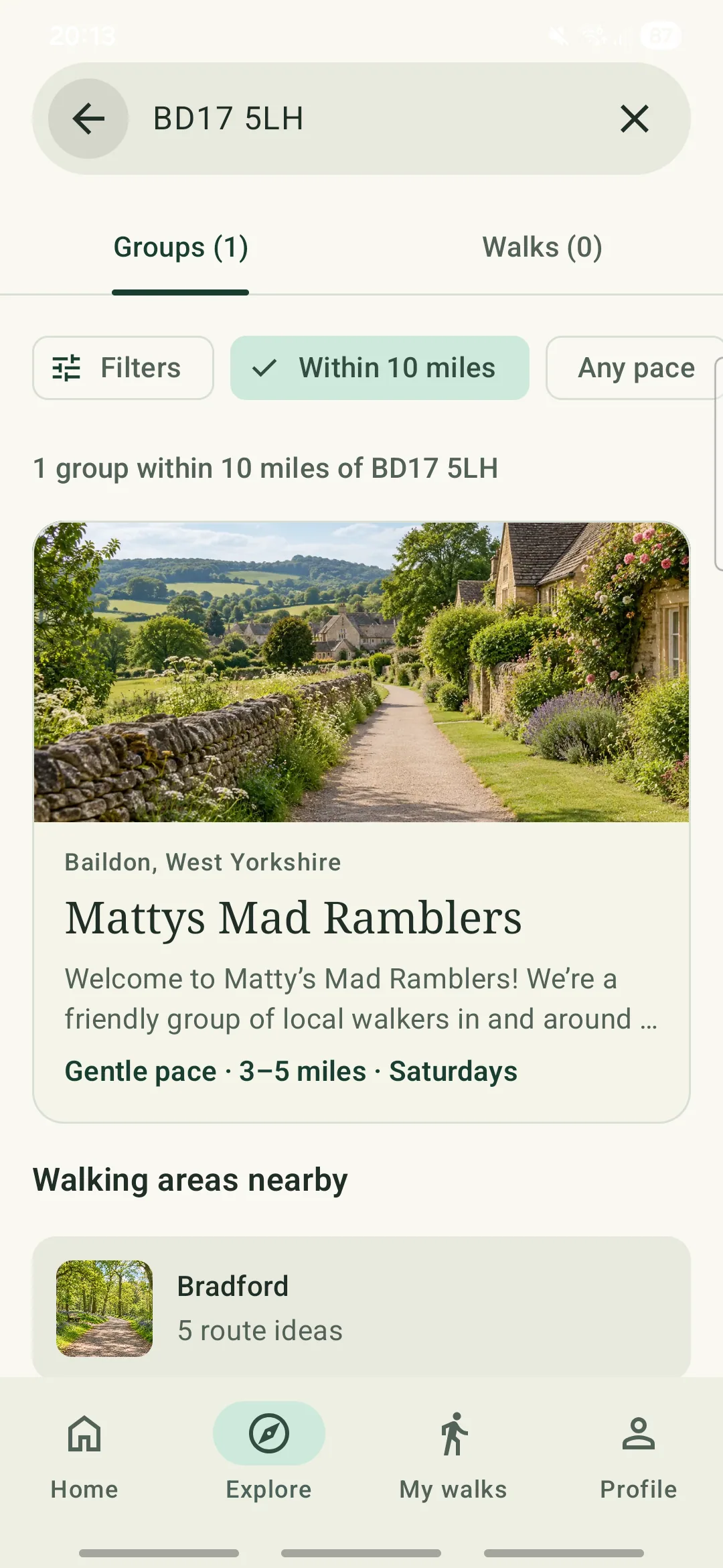
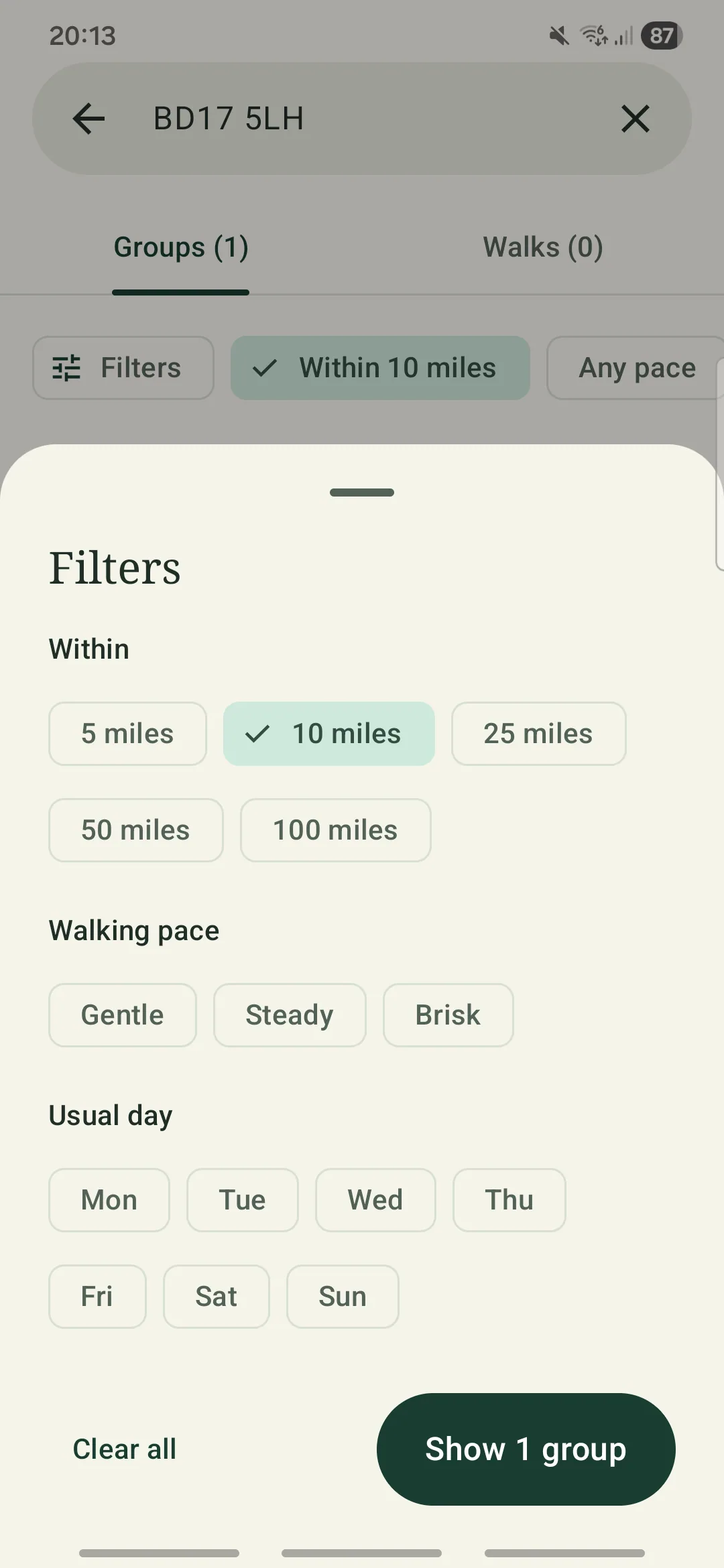
Home, Explore, My walks and Profile organise the core destinations. Search supports towns, postcodes and group names, with distance, pace and usual-day filters in a bottom sheet. This gives people a way to narrow the list without losing the search context.
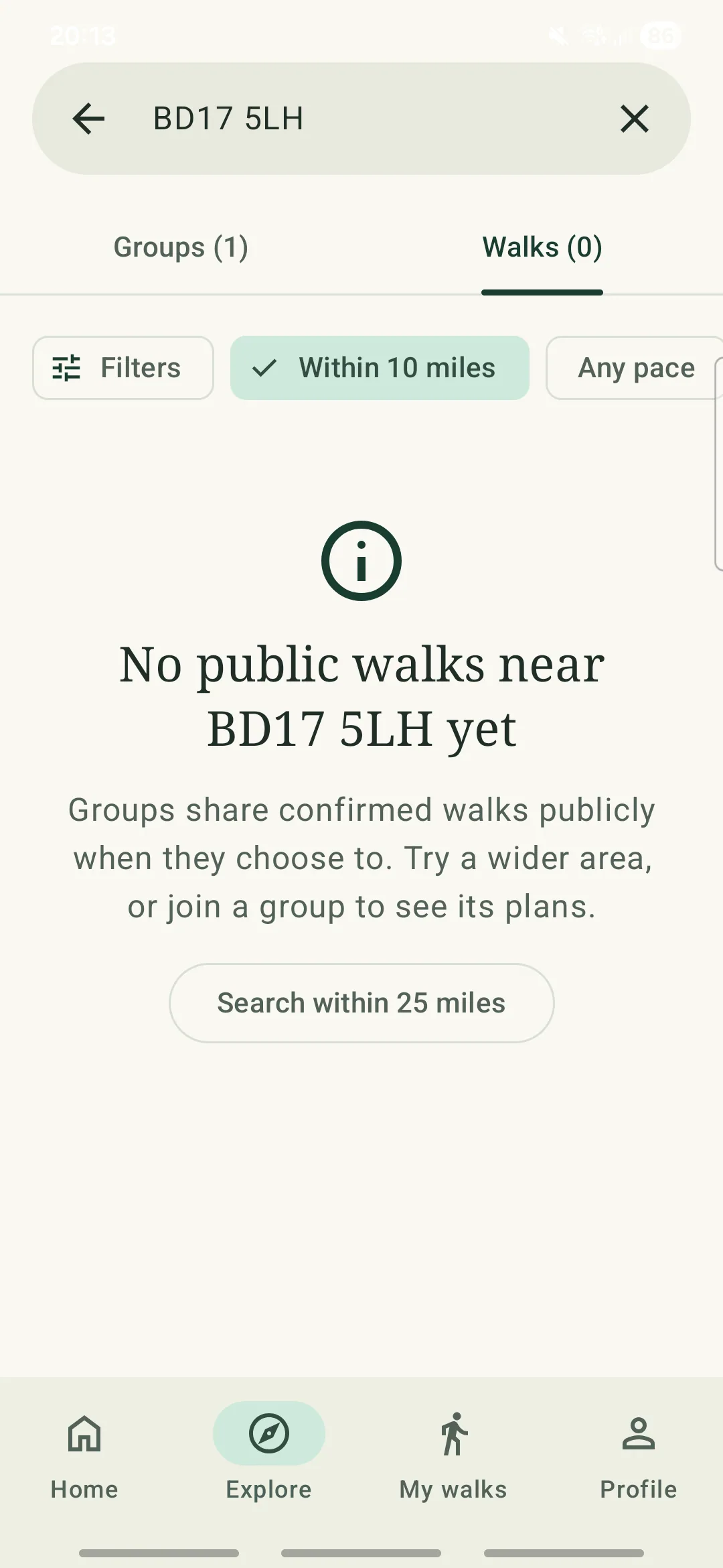
An empty result is part of the journey. The public-walks state explains that groups choose whether to share walks publicly, then offers a wider search. Location is optional and requested when the person chooses the location control; typing a place remains an alternative.
Results, refinement and a route out of an empty state
Search · Group results
Search · Filters sheet
Search · No public walks
Use the platform where it helps the task
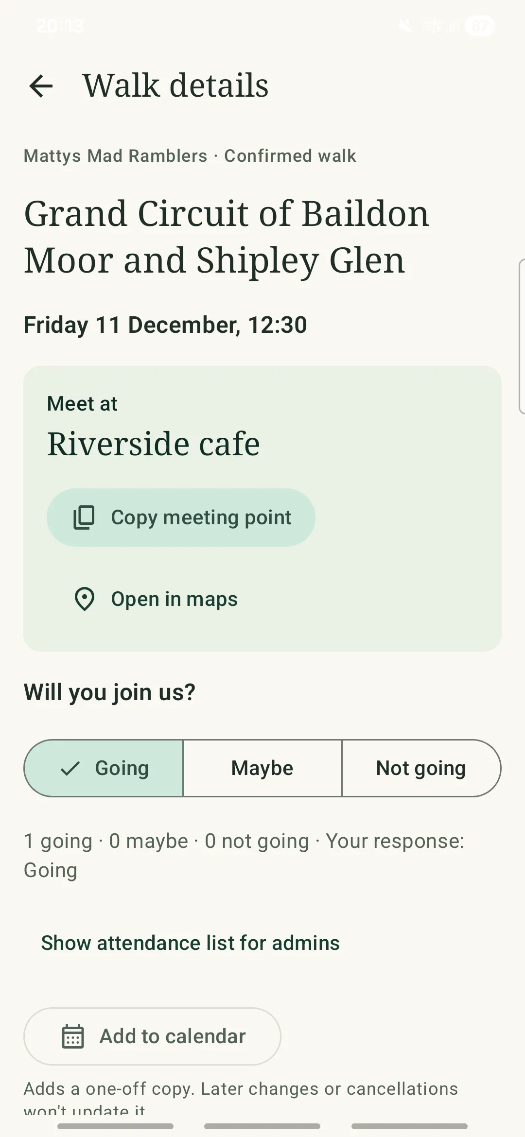
The walk detail screen brings the meeting point, attendance response and route expectations together. Copying a meeting point provides brief haptic feedback alongside visible confirmation, using Android’s system clipboard notification on Android 13 and above, or an in-app message on earlier versions. Haptics respect the user’s device settings and supplement the visual feedback.
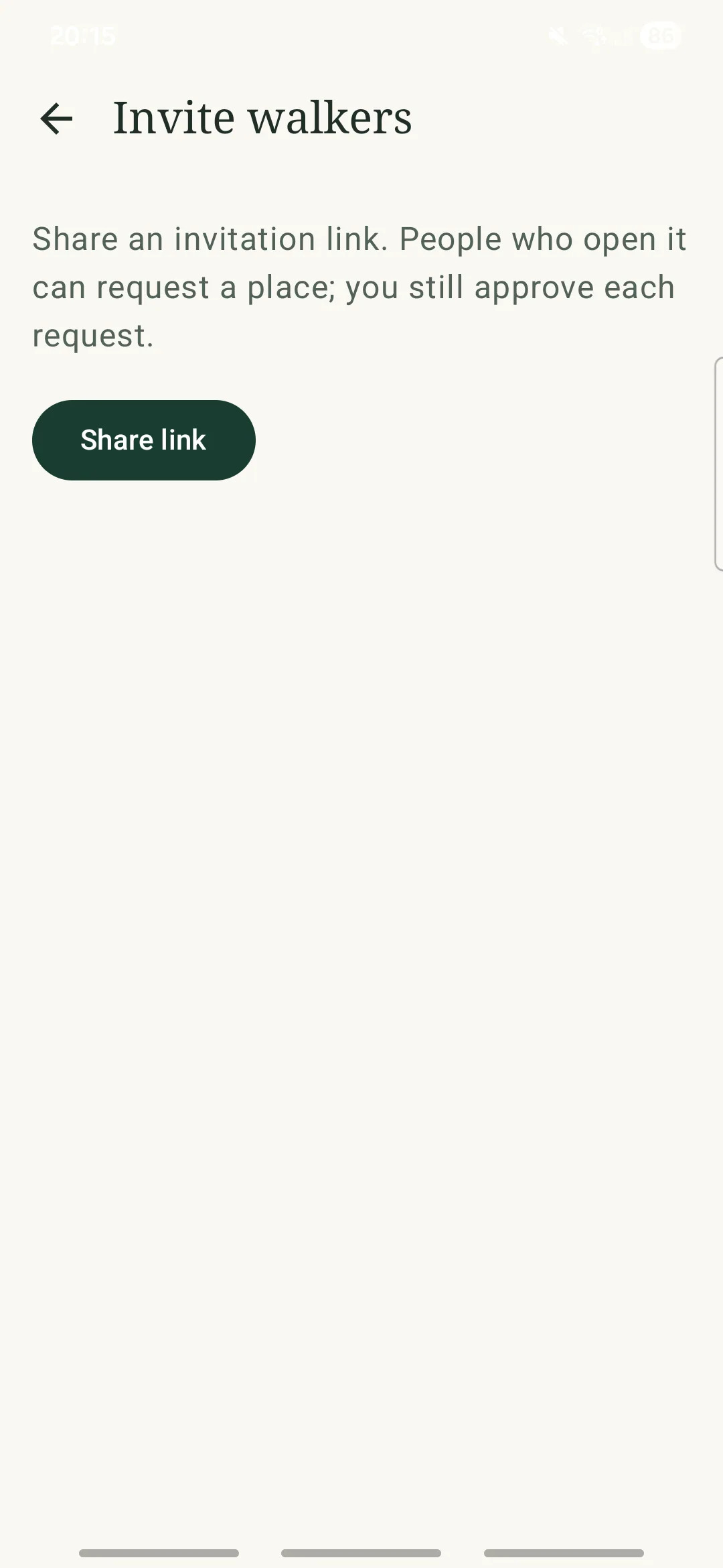
Open in maps hands the place to an installed maps app. Add to calendar opens a pre-filled calendar event for the person to review and save, without asking NextRamble to read their calendar. The interface explains that this is a one-off copy and later plan changes are not synchronised. Invitations similarly use Android’s share sheet. These are task-specific native behaviours, rather than a recreation of the web controls.
Further reading: Android Developers
Prepare for the walk and share with others
Walk details · Actions and attendance
Group administration · Share invitation
Use Material controls for dates and times
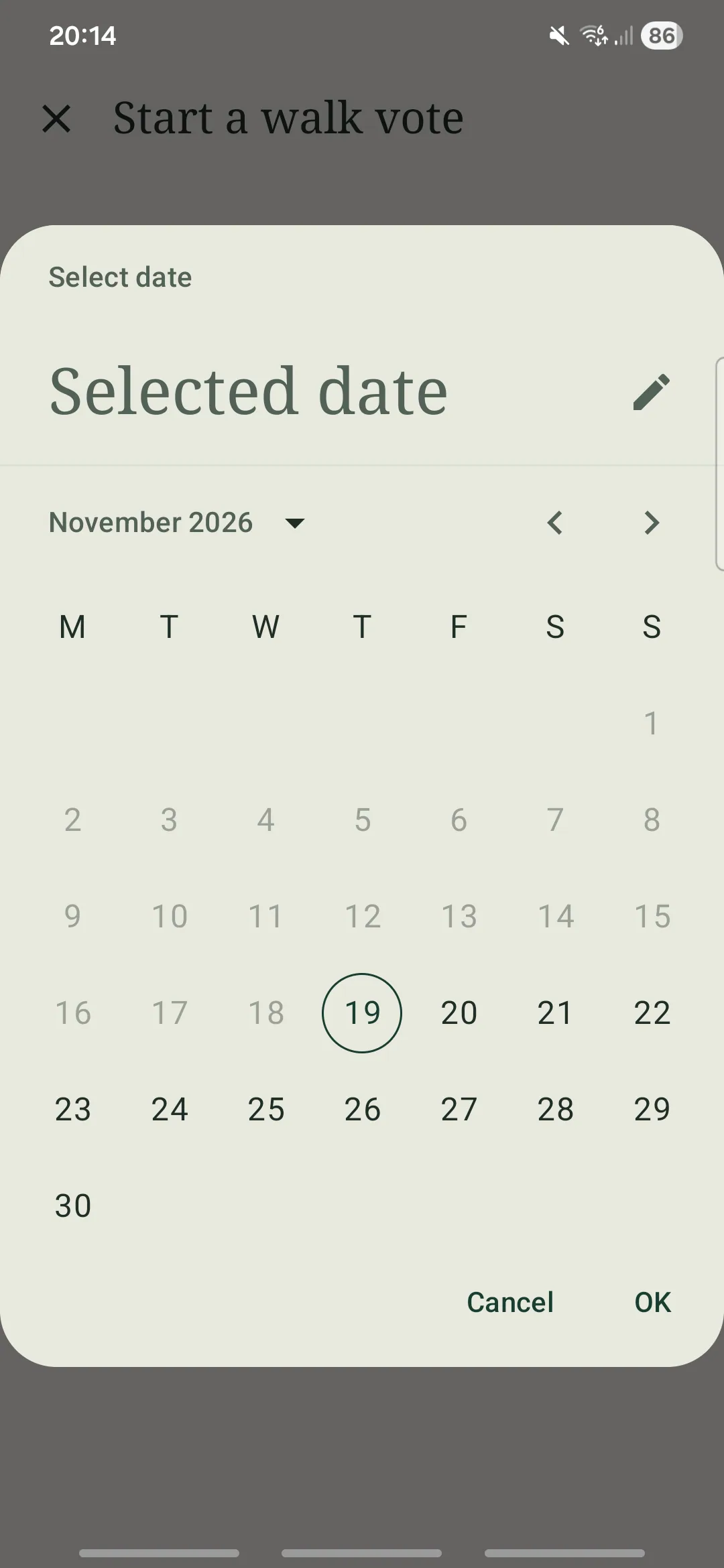
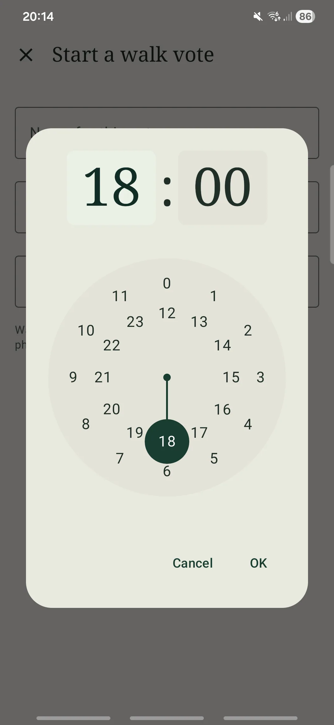
Starting a vote needs both a closing date and a closing time. I used the standard Material date and time controls, keeping those choices consistent with the rest of the Android experience.
I themed the Material 3 date and time pickers with NextRamble’s colour palette and typography, bringing standard components into the brand’s visual language while retaining their established interaction patterns.
Planning · Date picker
Planning · Time picker
Carry accessibility intent into native semantics
My web experience was useful, but the implementation model changed. HTML headings provide a ranked document structure and screen-reader navigation. Compose instead exposes an accessibility semantics tree. I used heading markers, meaningful action labels and grouped content, rather than assuming that visual typography alone would communicate structure to TalkBack.
For example, a walk row is designed as one actionable TalkBack stop, with its status, date, title, meeting context and group read together. Decorative children are excluded to avoid repeated announcements. The resulting grouping and reading order still need systematic TalkBack testing on the device.
The project also includes previews for 200% font scaling, dark appearance and landscape. These make review easier, but do not replace checking clipping, focus, announcements and touch interaction on real devices. I would validate the core journey with TalkBack users and retain visible feedback when haptics are disabled.
Further reading: Android DevelopersW3C Web Accessibility Initiative
What this demonstrates, and what comes next
I took an existing live service into a working native Android build, connecting Figma theming with real components and platform integrations. My local S23 FE testing established that I could install and use the build, and gave me a practical way to review its behaviour. It does not establish wider device compatibility, improved task completion or user adoption.
The next step is to observe walkers finding their next outing, responding and opening the meeting point. I would record task completion, hesitation and recovery, then compare the experience with the mobile web service before deciding whether a public Android release is justified. This is Android design experience; I would evaluate iOS separately against its own platform conventions.
Validate the core journey
Observe real group members checking a confirmed walk, responding and preparing to leave, including people with different access needs.
Check platform edge cases
Review TalkBack, large text, landscape, location denial, offline and stale data, and unavailable map or calendar handlers across more devices.
Decide the release scope
Use the findings to prioritise improvements and evaluate public distribution, rather than treating a working prototype as evidence of demand.
Sources and evidence
The screenshots are from my working Android build. Platform documentation informed implementation; it does not independently validate this app’s usability or accessibility.
Android Developers · Platform reference
Material Design 3 in Compose (opens in a new tab)Colour roles, typography, components and Material Theme Builder.
Laws of UX · Design principle
Jakob’s Law (opens in a new tab)Informed the use of familiar patterns, rather than serving as evidence of this app’s usability.
Android Developers · Platform reference
Add haptic feedback to events (opens in a new tab)Event-based haptics and platform preferences.
Android Developers · Platform reference
Semantics in Jetpack Compose (opens in a new tab)Accessibility semantics, headings, labels and grouping.
W3C Web Accessibility Initiative · Accessibility reference
Page structure: headings (opens in a new tab)The web comparison: meaningful headings support structure and navigation.