Fruugo · Design systems and AI
Connecting Fruugo’s design system and code
Approx. 6 min read
Building on design-system work since 2013, I connected Fruugo’s component library with Figma through Claude and MCP to support reviewed updates between design and code.
At a glance
- Problem
- Keep the design library aligned with maintained components as AI-assisted workflows become part of design and frontend delivery.
- What I did
- Connected Fruugo’s existing component library with Figma through Claude and MCP, then demonstrated a reviewed update in each direction.
- Outcome
- The connected library is available to Fruugo’s Design and Frontend teams. Completed FAB and calendar updates demonstrate both directions, with calendar text contrast improved from 3.49:1 to 11.80:1.
- My role
- Shared Figma library ownership, design-system integration, component alignment and implementation review
- Status
- Active internal workflow
- Project period
- 2026
Connected component library
The problem and goal
Design systems have been part of my design and frontend work since 2013. This case study focuses on the next step: using AI-assisted workflows to keep Fruugo’s established design system connected to its maintained component library.
When design and implementation drift apart, teams have to interpret which values, variants and behaviours to follow. I connected Fruugo’s existing React library with Figma through Claude and Model Context Protocol (MCP), so agreed changes can move in either direction with their component context intact.
My role and approach
At networx, I used Sass variables, mixins and interpolation to make frontend patterns consistent and maintainable. At Incommunities, I defined the company-wide design system and visual language across internal applications, replacing inconsistent themes with interfaces that worked on desktop, tablet and mobile.
At Fruugo, I created and maintain the shared Figma library, working with frontend developers to align components, interaction patterns and documentation with the existing React library in Storybook. The 2026 integration extends that responsibility. I created the connected Figma file, aligned its components and shared values, and established the workflow between tools.
The integration is available to Fruugo’s Design and Frontend teams. I enabled frontend colleagues to explore rapid prototyping by making the Claude and MCP workflow available alongside their Figma access. Wider use of the update workflow is still developing.
The implementation uses React, but the approach is framework agnostic: understand the existing component APIs, shared values and supported states before asking an agent to make changes.
Make the maintained library usable in Figma
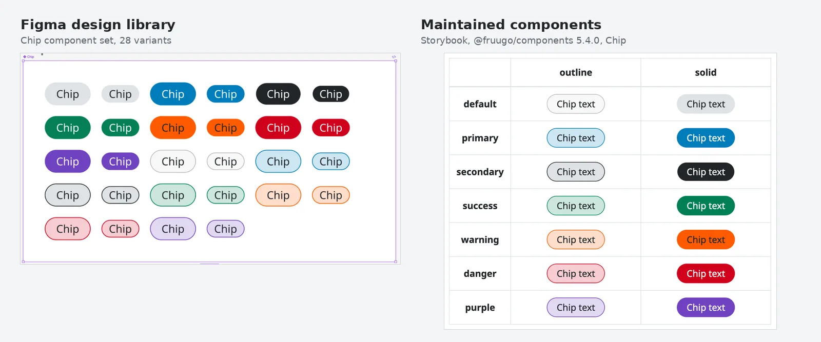
The Figma file brings foundations, icons, actions, form fields, selection controls, navigation, overlays and tables into a structure designers can use. Components and tokens come from Fruugo’s maintained component and shared styles packages.
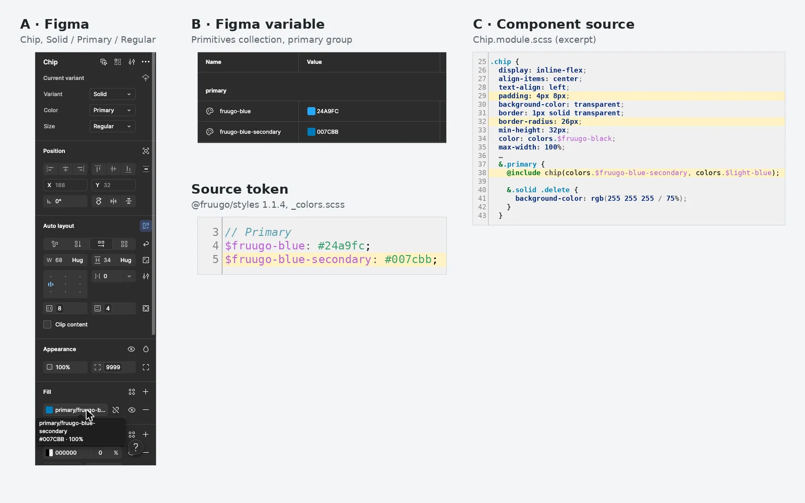
For example, the Chip library exposes solid and outline variants, colours and sizes alongside their Storybook equivalents. Its primary fill is bound to the same shared colour used in source, making that decision traceable between design and code.
Fruugo’s marketplace across 40+ countries needs components that accommodate translated content, including longer labels. I previously used Figma string variables to explore designs with translated text. I now use Figma’s AI translation capability for design exploration, reducing the need to maintain separate language variants at that stage. The aim remains to examine content in the interface; production translation management remains separate.
Connect variants, states and shared values
Component alignment
Support updates in both directions
The two examples below show changes starting in opposite tools. I checked the affected states and used the existing shared values, keeping each update scoped to the intended component change.
Carry a FAB colour change into Figma
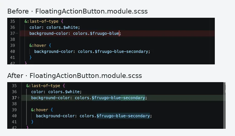
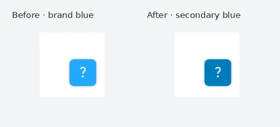
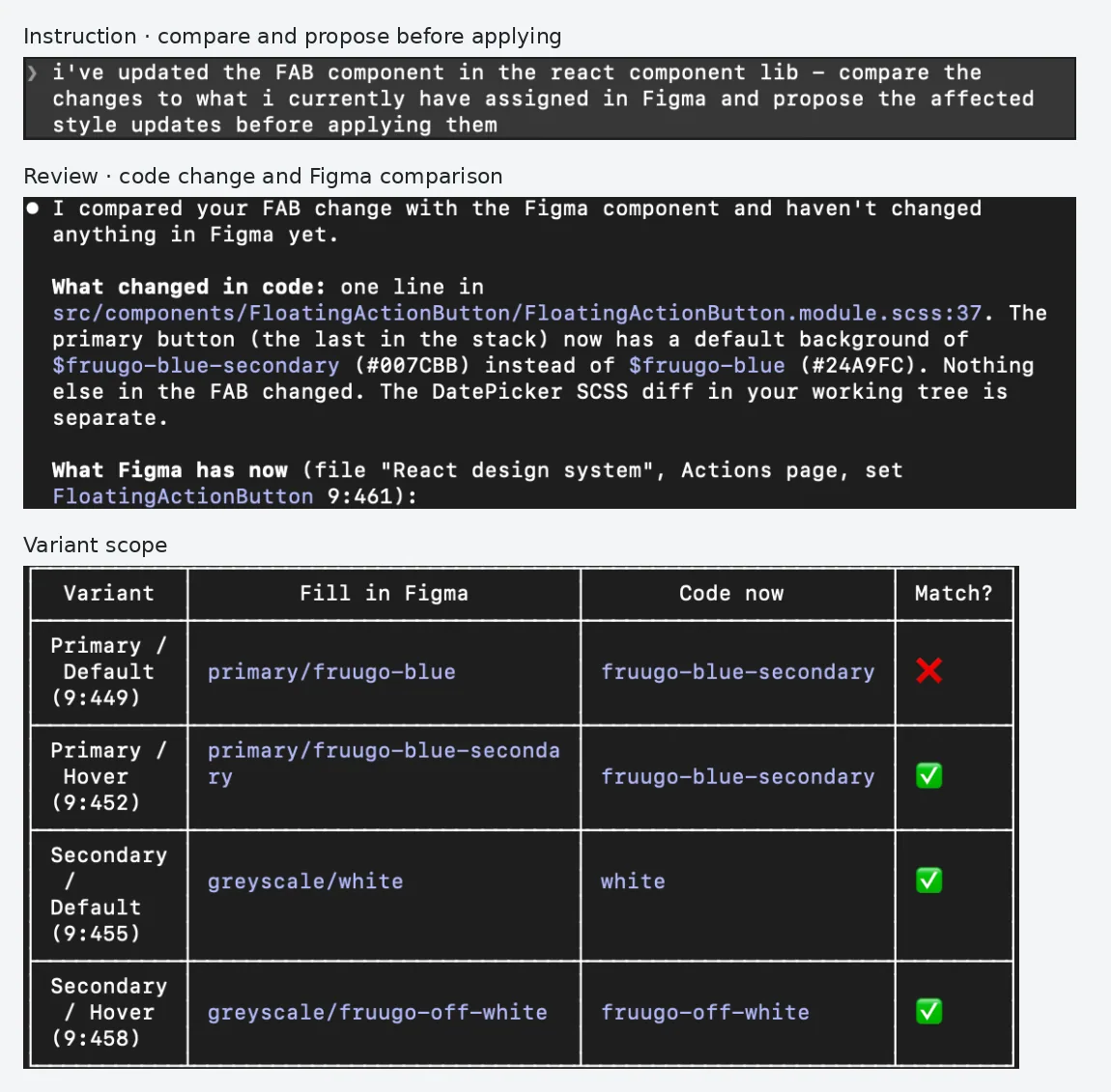
I changed the primary floating action button’s default background in source from brand blue to the shared secondary blue and checked it in Storybook. I then asked Claude to compare it with Figma and propose updates before applying them.
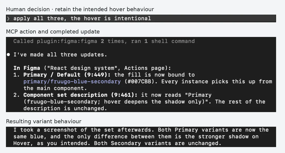
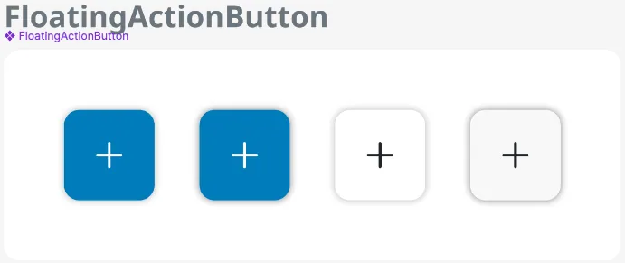
The comparison identified the primary default fill as the mismatch. I approved the update and confirmed that the matching hover colour was intentional, with a stronger shadow providing feedback. Claude bound the Figma default variant to the existing secondary-blue variable and aligned its description and source documentation. The secondary variants were retained.
1 · Code to Figma · Source change
2 · Rendered change in Storybook
3 · Compare before applying
4 · Human approval and MCP update
5 · Matching component states in Figma
Carry a calendar contrast change into code
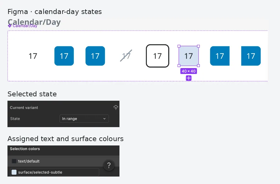
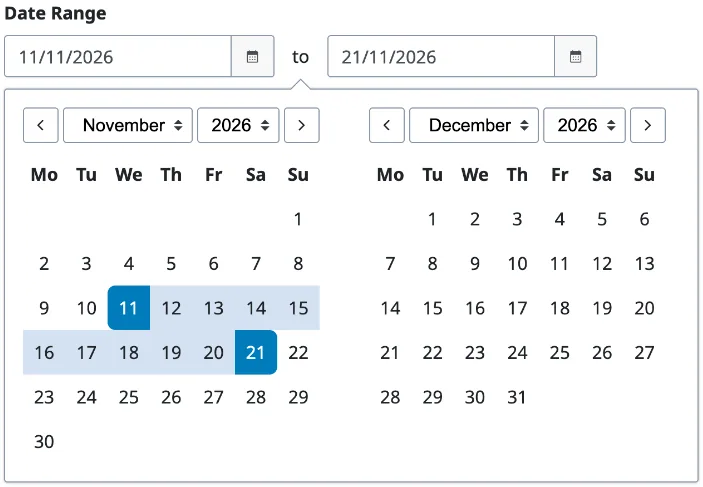
I changed the calendar’s In range text in Figma from secondary blue (#007CBB) to Fruugo black (#212529), retaining the pale-blue background (#D4E3F1). For these colours, contrast increases from 3.49:1 to 11.80:1. The original pairing falls below the normal-text AA minimum of 4.5:1 and AAA minimum of 7:1; the new pairing exceeds both text-contrast thresholds.
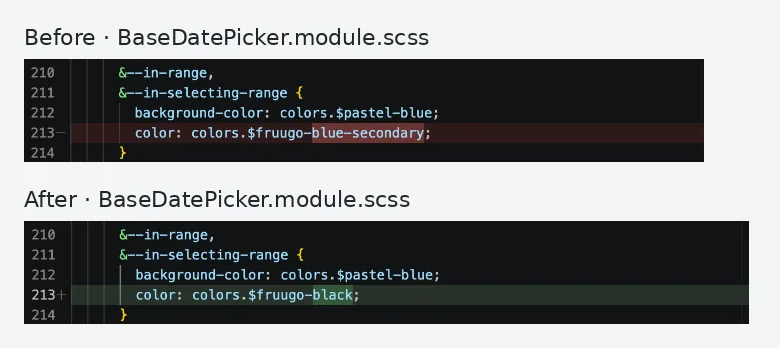
I asked Claude to inspect the Figma state through MCP and update the component library. The diff changes the in-range and in-selecting-range text in the shared date-picker stylesheet, so the fix sits in the reusable component rather than a screen-specific override. I checked the DateRangePicker in Storybook, including the distinct range endpoints. This verifies the colour change, not complete accessibility compliance or deployment to every consuming product.
1 · Figma to code · Design decision
2 · Prompt and MCP inspection
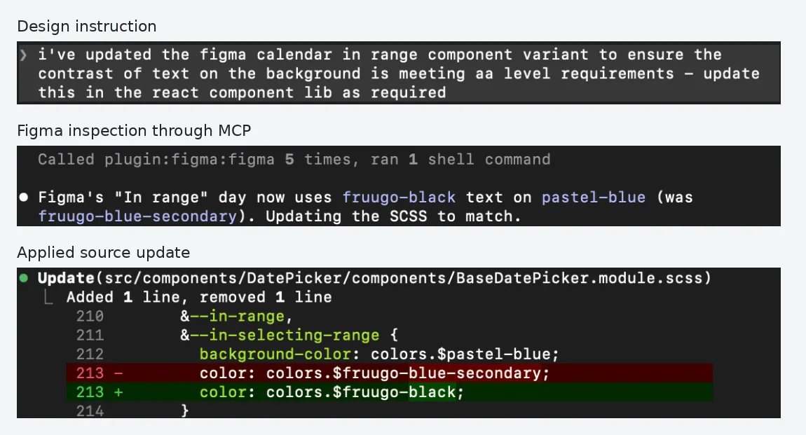
3 · Change in the component source
4 · Rendered result in Storybook
Govern changes through existing review processes
Figma-to-code changes follow Fruugo’s existing commit and code-review process before reaching production. Design intent still needs human review, and engineers retain responsibility for reviewing the implementation. The MCP connection does not bypass those steps.
For code-to-Figma updates, I review the proposed component changes before applying them. Publishing the updated Figma library includes a message explaining the reason for the change, giving colleagues context when reviewing the library update. The FAB example shows the comparison, my approval and the resulting change.
The Chip audit showed why that judgement matters. It exposed hard-coded component values without matching tokens. I reverted the entire token-binding experiment because Figma-only changes would have created a different system. No changes from that experiment were retained. The useful result was a clear list of gaps in token coverage that need a joint design and engineering decision.
Delivery and outcomes
Fruugo’s Design and Frontend teams now have access to the connected library, with reviewed updates demonstrated in both directions. The FAB example carries an implementation decision into Figma; the calendar example carries a design decision into a shared stylesheet and improves normal-text contrast from 3.49:1 to 11.80:1.
This extends my ongoing design-system ownership into an AI-assisted workflow while retaining established review processes. The result is a working connection that makes component decisions traceable across design and implementation.
Next steps
Resolve token gaps together
Review the Chip audit with Frontend and agree which values need shared tokens, which should use the existing scale and which should remain component-specific.
Clarify the contribution route
Make the route for Figma-originated changes explicit, including design review, engineering review and the link between a code change and its Figma library update.
Understand adoption
Record completed updates in each direction and gather team feedback to understand where the workflow helps and where guidance needs improving.
Sources and evidence
The contrast calculations below use the calendar’s specified colours. WCAG references explain the normal-text thresholds.
WebAIM · 17 November 2026
Original calendar colour pairing (opens in a new tab)Secondary blue and pale blue: calculated contrast 3.49:1.
WebAIM · 17 November 2026
Updated calendar colour pairing (opens in a new tab)Fruugo black and pale blue: calculated contrast 11.80:1.
W3C · WCAG 2.2
WCAG 2.2 text-contrast criteria (opens in a new tab)Normal-text minimums: 4.5:1 at AA (1.4.3), 7:1 at AAA (1.4.6).